I was looking for a new challenge and opportunity arose within the Virgin Media side of the business. I was seconded to the Virgin Media Optimisation team, where we worked on solving customer issues while aligning with business goals. This involved rapid, data-driven experiments and innovations, all while ensuring an excellent customer experience.
I became the first designer in the Virgin Media O2 creative team to work across both brands.
My adaptable skillset allowed for a swift transition into this role, and the positive feedback I received led to me joining the team permanently.

Product summary - Customisation page

Brief
Previous tests have shown a lot of users click through to the customisation page directly from the product cards, but they drop off later in checkout journey. We think this might be due to the lack of clear basket summary within the customisation page.

Pricing breakdown
By adding a clearer product and pricing summary for users who go through customisation page via the product cards will provide reassurance for their product selection and give them the confidence to proceed with their order. This is a desktop breakpoint test.
In an effort to minimize the page height, I changed the placement of the pricing summary to the top right on a desktop screen. In the pricing summary, I grouped the key packages—broadband, TV, and mobile into a drop down accordion, so customers were able to focus on the key details.
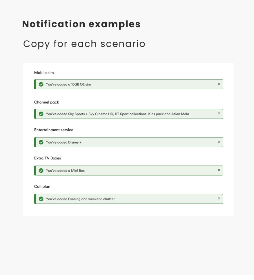
Notifications
To address the issue of customers not noticing changes in their basket, I introduced a banner, inspired by a previous animation task, to clearly indicate any modifications. Additionally, the small price summary now allows customers to easily view these changes.
Result
The test was concluded as a neutral result. The overall conversion rate (CVR) saw a statistically insignificant decline across devices.
In Net Sales per Page (NSP), all test pages, except the review basket step, showed a significant positive uplift. However, the basket had a significant decline, suggesting users weren't ready for commitment. Users clicking on the product CTA card had a positive conversion rate of over 7%, but progression from "Your Details" to "Review Submit" was down, likely due to customers not being ready to commit.
TV Page redesign

Brief
28000 customers who land on the TV page currently don’t enter their postcode (57%). By updating the hero banner (pre serviceability) we hope to increase serviceability completions.

Research
I researched competitors and streaming companies and observed that their websites often use dynamic photography to convey excitement. Additionally, many create a cinematic feel through the use of dark backgrounds.
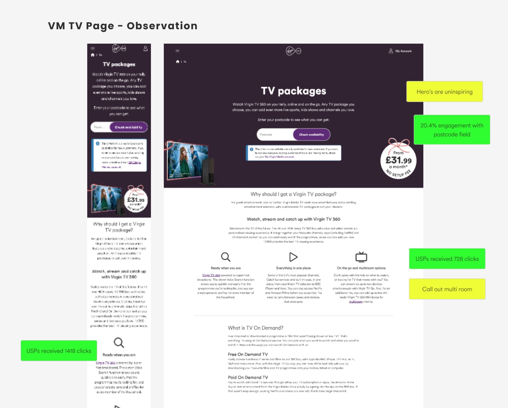
Virgin Media - TV Page
After reviewing the current pages, I found the hero section uninspiring. Given how much space it occupied, I concluded that we should utilise it more effectively to make it more engaging and marketable.

Content square
I observed data from Content Square to define the hierarchy of the page.
Key Insights
Desktop:
Customers remain inactive (aside from postcode entry) for the first 60 seconds.
Most clicked sections:
FAQs: 2,887 clicks
"Ready when you are": 728 clicks
"Everything in one place" & "On the go/multiroom options": 659 clicks
Sky: 656 clicks
Mobile:
Users engage with the page earlier, clicking before 60 seconds.
Most clicked sections:
FAQs: 3,540 clicks
"Ready when you are": 1,418 clicks
"Everything in one place" & "On the go/multiroom options": 1,418 clicks
Sky Sport: 1,269 clicks

Ideation
I had lots of ideas and managed to narrowed them down to three key concepts:
Entertainment for Everyone – Highlighting entertainment that appeals to all audiences, featuring the latest TV shows, upcoming sports events, and movies. Users could navigate through the carousel using thumbnails for a seamless experience.
Maximizing the VM Carousel – Showcasing the incredible entertainment available by leveraging the existing VM carousel mechanism from the homepage to create an engaging and familiar browsing experience.
Thematic Highlights – Utilizing the space to spotlight seasonal themes, such as a festive collection. For example, promoting must-watch Christmas movies for customers who subscribe to a particular package.

Final design
The TV section emphasises our channels, apps, and on-demand content. The next segment delves into sports entertainment, followed by a section highlighting movies, channels, and the Virgin Media Store. The Multi-room section details the perks, and the final section integrates a cross-selling element for an O2 SIM. The FAQs and Popular Links are placed at the bottom for SEO, and the legal information has been minimised into an accordion. Touch-points across the page include the CTA "Check Your Postcode," which would anchor users to the hero banner, encouraging them to enter their postcode.
Test result
Overall, the results show positive trends. SVC completion saw a statistically significant 16% increase across all devices, and while CVR also improved, numbers were small.
Mobile saw a nearly 30% uplift in users entering the basket post-SVC, though not statistically significant. The most engaged CTA was "Watch Anywhere," likely due to its top placement.
A 7% decline was noted in users moving from postcode entry to the basket, possibly due to content relevance or pricing hesitation.
Engagement is improving, and optimising CTA placement and post-SVC content could further boost conversions.
Black Friday - Exit intent overlay
Brief
There is a concern that customers make an assumption that Black Friday deals get better towards the Black Friday weekend, or they might get a better deal somewhere else.
We wanted to reassure customers, who are about to abandon checkout that our best deals are online and these deals are as good as they get. And hopefully by doing that it will encourage customers to purchase, resulting in a increase of order conversion.

Design
With the designs, I created a pop-up banner which would trigger once a user is about to abandon the page. The visual is designed to communicate that these are the best deals you're going to get, and I've also tried to highlight there is a best price guarantee within the purple badge.
Result
The results were quite encouraging, it ran for two weeks, and we found 11% of users interacted with the order button which lead to a 53% conversion rate. But what we found was the performance dropped on the actual Black Friday weekend. So we decided to retest the solution during Winter Sale, as it provides a longer testing period, so this test will run for 3 weeks. And we want to see if the same issue happens again.